Written by:
  Earlier this month, we explored how you can use effective calls to action in your online marketing. Now, let's look at what happens after that first click.
A landing page, or lead capture page, is the online destination that a prospect is taken to once they click on a call to action (CTA) like "download a brochure" or "sign up for a free demo." A landing page is very targeted. It only talks about the special offer at hand. The goal is to collect visitors' contact information; once they provide some basic contact details, they can then redeem or receive the promotion.
Just like a call to action, a landing page needs to be carefully crafted in order to maximize its potential. Check out these eight tips to make sure you have all your bases covered when it comes to landing page optimization.
Landing Page Tips
Master these landing page basics for lead generation success:
The Headline
Tip: Make It Prominent
A clear, prominent headline helps people get a quick idea of what your landing page is about. Remember, time is valuable, and you have just a few second to make an impression and get people to understand. Give people a quick, easy way to digest what's on the page.
Tip: Make It Relevant
You need to meet your prospect's expectations. The landing page needs to deliver on the promise you made in your call to action. The headline is one of the first things the person will see. Make sure the language you use here aligns with the language in the CTA. This will help assure people that they're in the right place and they're looking at the right thing.
On this Hubspot landing page, the headline stands out and clearly explains what the visitor will receive.

The headline also clearly relates to the call to action you have to click in order to get to the landing page.
The Copy
Tip: Describe The Offer
Give potential customers a brief, but detailed, description of the full offer. Explain exactly what the offer is, when or how the offer can be redeemed, and other pertinent information.
Tip: Explain Benefits
In addition to explaining the offer, you need to tell people what they'll get out of it. What problem are you solving? How will the prospect's life or job become easier? What's the value to them?
Tip: Make It Easy To Read
Use short sentences and short paragraphs. Use subheadlines to break up information, where necessary. Use lists to help present information in a way that's quick and easy to skim.
And don't forget to proofread! Typos will make your copy harder to read; plus, mistakes can call your professionalism into question.

On our own landing pages, we keep copy short, sweet and easy to read.
The Lead Capture Form
Tip: Only Ask For The Essentials
Generally, shorter forms tend to have higher conversion rates. As you add more fields to a form, it creates more work for the visitor. Plus, depending on where the person is in the buying cycle, they may not be comfortable enough with your company to "give away" details like an address or anticipated budget.
Court your potential customers carefully, and ask for the basics--such as name, email, phone number--at first. You can follow up later, once you've had time to establish a rapport, to get more detailed contact and background information.
You may find, however, that you get more qualified leads if they have to fill in more form fields. Sure, this will lower your conversion rate, but you'll have less work to sort through "junk" leads. The key here is to test the number of form fields and decide what's right for your company based on results.
Tip: Make It Stand Out
Filling out the form is the key action you want to trigger. You can make the form stand out in a number of ways, like:
- Use a subheadline to distinguish it
- Use contrasting colors to highlight it
- Put it in a prominent place
Work with your inbound marketing team to make sure that the form has enough "pop."
Tip: Keep It Action-Oriented
The "submit" button is a small detail, but it can definitely have an impact on your landing page. Don't fall into the trap of using a button that says "click here to submit." The online world can be a scary one, and people are wary of vague links.
Use the "submit" button as a way to restate and reinforce the action. "Sign up for your demo" or "Download your ebook now" paint a clear picture of what will happen.
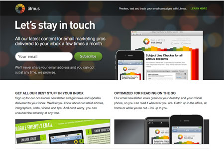
On the landing page for its email newsletter, Litmus makes the lead capture form stand out with its placement up top. They ask for just one field (an email address). And when you're done with the form, you "subscribe" to the newsletter...keeping in line with the overall landing page purpose.
The "Human" Element
Tip: Use Imagery, Video or Other Details to Make Things Real, Add Personality
People want to do business with other people. And they want to be sure that they're getting the "real deal" from a real deal. Consider using photography or other visual or interactive elements to create a connection.
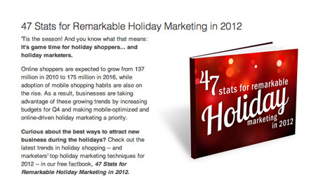
For example, you could show a cover image of your free ebook so people can "see" what they're getting.
Video can be another great addition to a landing page. People love watching video online. Show a customer using your product, record and share a video testimonial, or use a video to quickly introduce people to your company so they can put a name, a face, and a voice to your team.
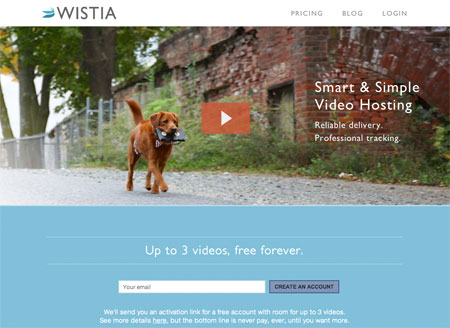
Video hosting service Wistia makes video a key element of their landing page strategy.
The Navigation
Tip: Limit Options
You want to keep prospects focused on the task at hand. Removing your main website navigation is ideal on landing pages. This way, you limit distractions and prevent visitors from leaving the page before they convert.

On this landing page for Terminix, there is no navigation that could potentially lead visitors astray.
Are your landings pages in tip-top shape? Are you looking for ways that you could improve your online lead generation efforts? Get in touch; we'd love to help!
Photo credit: Tom Magliery