When customers arrive at your company website, there are two possibilities: they'll either stick around, looking for something specific or engaging with your content, or they'll quickly move on if they can't find what they're looking for.
It doesn't take much time for a potential customer to abandon your website. As such, an important part of website optimization involves crafting landing pages that engage customers and generate leads. Start by avoiding these four common landing page mistakes that will turn customers away.
1. Lack of relevance or connection with call to action
When you're writing and designing your landing page, you have to consider the whole experience. Chances are, one of five things will bring your visitors to your landing page:
- Paid search ad
- Google organic search placement
- Call to action on your website
- Ad banner
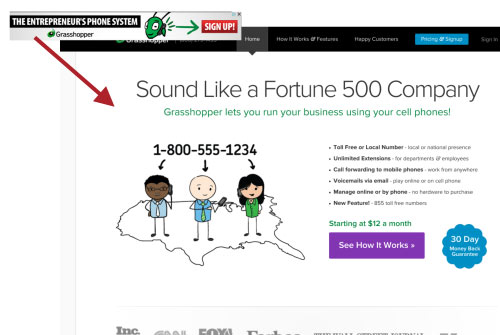
The great news is that you have some control over each of these placements. When someone clicks one of these and comes to your landing page, the page better be related to the advertisement. For example, if your ad banner says "sign up," your landing page better focus on signing up.
 In this example, the banner call to action says "sign up." The landing page, however, focuses on "seeing how it works." There's a disconnect between the banner and the landing page.
2. Bombarding visitors with offers (lack of focus)
The focus (notice I said "the focus," not "a focus") needs to be on getting your visitor to take an action. When you optimize your landing pages, ask yourself if each page element encourages action. If it doesn't, remove it.
All too often, we see landing pages with a running list of blog post titles, sales announcements that don't pertain to the main offer, a company news feed, social media feeds, secondary offers or banners that distract or don't add value, and more.
Effective landing pages have a singular focus, supported by the copy and the visuals.
3. Getting carried away with artistry
We've said it before -- a website is not an art project -- and this is especially true with your landing pages. You want your landing pages to be professionally designed, but don't be overly artistic or creative with your visuals. The key is not to overdo the design. Don't spend your time on visual embellishment, spend it on creative copy.
If you want your visitor to download your white paper, you don't need a swarm of images or visual embellishments. You also don't need to put secondary offers on your landing pages that might lead your visitor away from your landing page or distract them.
Well optimized landing pages are cleanly designed without overdone visuals.
4. Lack of visitor guidance
Tell your visitor what you are offering and set their expectation about what they are going to get. The landing page should be designed so that visitors clearly know how to take action and what to expect once they do. Visitors need to be able to quickly find what they're looking for: a way to sign up for your service, download some of your well-written content, etc. Your landing page copy needs to set the expectations for the next step in a clear, concise way.
Setting your visitors' expectations is critical. If you want them to download your latest product guide, you need to tell them what they can expect to find in the product guide that they can't find on your website or by searching the web. If you want them to try your software, be sure to remind them of the benefits of the software that they will experience in the trial version. Be customer-focused, concentrating on giving your customer the best possible value. Their name, email address and phone numbers don't come without a price. They need to know they will find value if they take an action.
Avoid these four landing page mistakes and you'll be well on your way to better website optimization. As a general rule, we like to see at least a 30% conversion rate on landing pages we produce. No matter what your conversion rate, never settle. Keep testing and improving those landing pages!


