Custom Website Redesign Service Built on HubSpot or WordPress
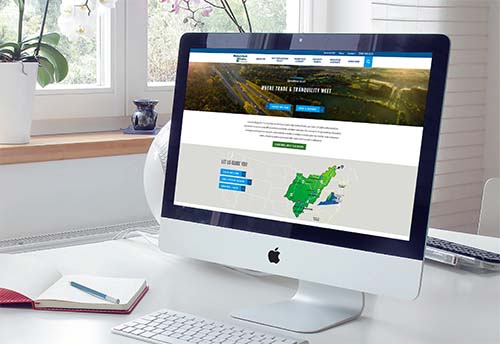
Transform your website into a sales engine for your company. Grow your audience, increase lead capture, get more sales opportunities, and meet the demands of today's buyers.
Transform your website into a sales engine for your company. Grow your audience, increase lead capture, get more sales opportunities, and meet the demands of today's buyers.

Our web design work not only captivates visually but also helps companies achieving business goals. View all case studies.
Our expertise is industry recognized


Website Grader
Grade your website in seconds. Then learn how to improve it for free.

Website Redesign Insights
Stay Informed
Subscribe to The Digital Slate newsletter from Whittington Consulting