 There are very few industries that have not gone through significant changes in the past 10 years thanks to technological advancements. Cutting-edge fields like medicine are always advancing, of course. But thanks to new technologies, now so are traditional and industrial fields like home builders and manufacturing.
It might not come as a surprise that website redesign would change so much -- after all, it’s based in the very vehicle of that change, the Internet. But what’s really interesting is seeing how individual technological advancements such as the mobile device and tablet have changed the industry as a whole. Of course, it’s a lot more than just phones and tablets, and that’s the topic of today’s blog.
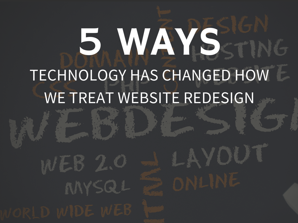
Interested in how website redesign has morphed over the years? Here are five ways that developments in technology have changed website redesign as you know it:
1. Getting Internet on Your Phone Inspired Responsive Design
Most website redesign projects today have responsive design on the to-do list, especially since the Mobilegeddon Google update. 27% of people will leave a site if it is not mobile-optimized (source: ExactTarget, 2014 Mobile Behavior Report), and 61% of companies have created a mobile site or optimized their existing site for mobile (source: Chief Marketer, Mobile Marketing Survey 2012). Thanks to technology and the development of different sizes of mobile devices, your website has to look good on several different kinds of screens. That means that during a website redesign, you must carefully plan out your design to meet the needs of your customers when they view the website on a mobile device.
2. Mobile Data Plans Limit Web Page Sizes
Mobile technology is responsible for another big change, too: the size (load time) of websites. Since most customers sign up for a specific mobile phone plan with a data limit, marketers need to take website page sizes into consideration when they go through a website redesign. You can have the most beautiful and targeted website ever, but if it takes more than 10 seconds to load it won’t achieve your marketing goals. Marketers and designers, then, need to be responsible with the file size of web pages.
3. Testing Opportunities Leave No Excuse for Bad Performance
Technological advancement also comes in the form of new services. Now that websites and digital traffic are incredibly important factors of business success, companies have developed tools to allow you to do browser testing and device testing during your website redesign. This means that there’s no excuse for poor performance once your website is live because you have all the tools you need to make sure the website achieves optimal performance.
4. Wearable Technology Challenges Our Assumptions
Who can talk about technology without discussing the ever-shrinking screen sizes of wearable technology? The best example right now is the Apple Watch, an expensive gadget that many early adopters are trying out. As screens get smaller and smaller, website designers will need to take this into account when they design these sites. And it also points to a future without screens as we know them today: Google Glass, virtual reality devices, and voice technology.
5. Lower Attention Spans and Higher Expectations Lead to Simpler Designs
The decline of the American attention span thanks to technology has been well-documented over the years. But with this lower attention span comes a higher expectation for user experience. The less interested or entertained a visitor is, the less likely he will be to stick around. When it comes to website redesign, this means that simple and clear will trump complicated and confusing. Website designs that speak directly to the visitor’s needs will be the priority over flashy design.
Every industry faces change over time. It’s a fact of life as individuals and businesses learn more about themselves and the world outside of them. But in the field of website redesign, at least, you can point to specific technological advancements that helped encourage these changes.
How has technology changed since your company’s last website redesign? Is it time to re-evaluate your website in light of technological changes?