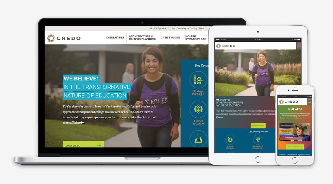
We recently completed a website redesign project for Credo, an expert higher education consulting firm headquartered in North Carolina. Credo specializes in working with private colleges and universities around the country, offering a wide variety of consulting services across almost all major areas of institutional strategy and operation.
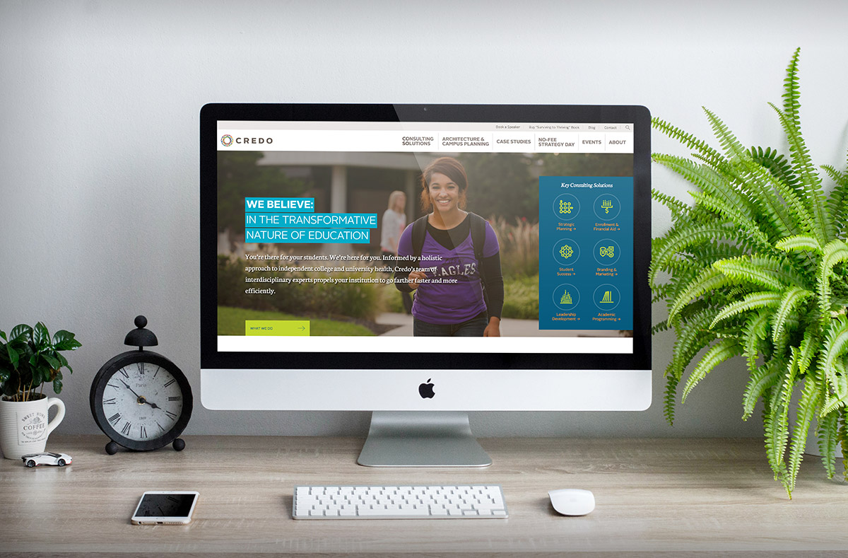
Luckily, our team had been consulting with Credo on inbound marketing, so we had considerable background from which to work. As a part of that work, we had already defined customer personas for Credo, including their characteristics, key marketing messages and sales objections. (Had we not worked with Credo prior to their website redesign, we would have taken them through a persona definition process.)
The project began with a trip to North Carolina, where our team led a strategy session to share our ideas for their website redesign, as well as get their input. Credo has a Chief Brand Officer and a small marketing team, and they have done a superb job over the years defining their brand. Because of this, there were already visual brand elements in place in their print collateral. These visual brand components, however, never made it to their old website.
Credo is a well positioned expert consulting firm, too, so they have a tightly defined target prospect. Because of this, we were able to have sophisticated conversations around triggers that cause their target prospect to visit their website and specific information these prospects were seeking. We discussed their sales process and how the company generates leads as well as high impact touchpoints where prospects engage the firm.
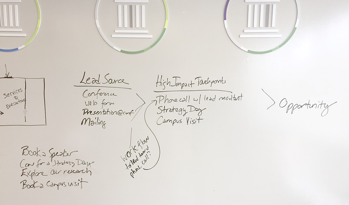
Upon our return to Richmond, our team used the discussions from the meeting to create a sitemap -- an outline of website content. Because we would be using mostly content from the existing website, we mapped out on a whiteboard where current content overlapped and where it was confusing.
We completely overhauled their old website's content structure, aiming to fix misnamed sections and sought to make the high impact sales touchpoints as visibly as possible in the content (prior to the redesign one of their key services was not easily accessible). Our marketing team conducted SEO keyword research in order to optimize the sections for SEO.
From there, we moved on to wireframing, which is where our designer sketched on paper a number of loose page layouts. While wireframing is an internal process that our clients don't see, it's an efficient way to organize content on pages without getting caught up in colors and pictures, or how things look.
The homepage and other pages were then designed, and we showed the Credo team this picture of how the homepage would look on screen and on mobile devices. Because of Credo's mature existing brand, we integrated many of their existing design patterns into the website design so the website would be consistent with their printed material.
As with most designs, Credo had plenty of points of debate during their first review of our design work. There were cases where Credo's team identified issues, then challenged us to find solutions to those issues.
During design, the two most significant points of conflict were the website's navigation design and the campus architecture portfolio.
When we showed Credo the very first homepage design (see below), we had designed a progressive navigation system for the website where the site's menu would appear after someone clicked a menu button. During review, our team and theirs discussed the need for a more standard menu across the top of pages to make navigation more traditional. We also had placed an abstract graphic at the top of the homepage as a background, and the Credo team preferred we use an actual photograph, which added some visual impact.
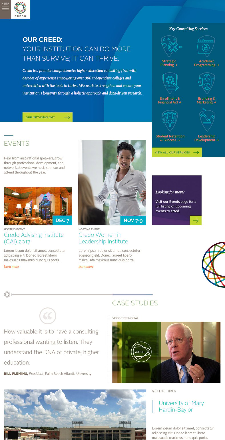
The first homepage mockup we showed the Credo team
Our biggest point of discussion during design ended up being the campus architecture portfolio. Credo's leadership team wanted to feature their work in a separate section that was designed differently than other similar pages on the website. It needed to feel like it's own section, so we developed page variations so Credo's work could be shown in a larger format.
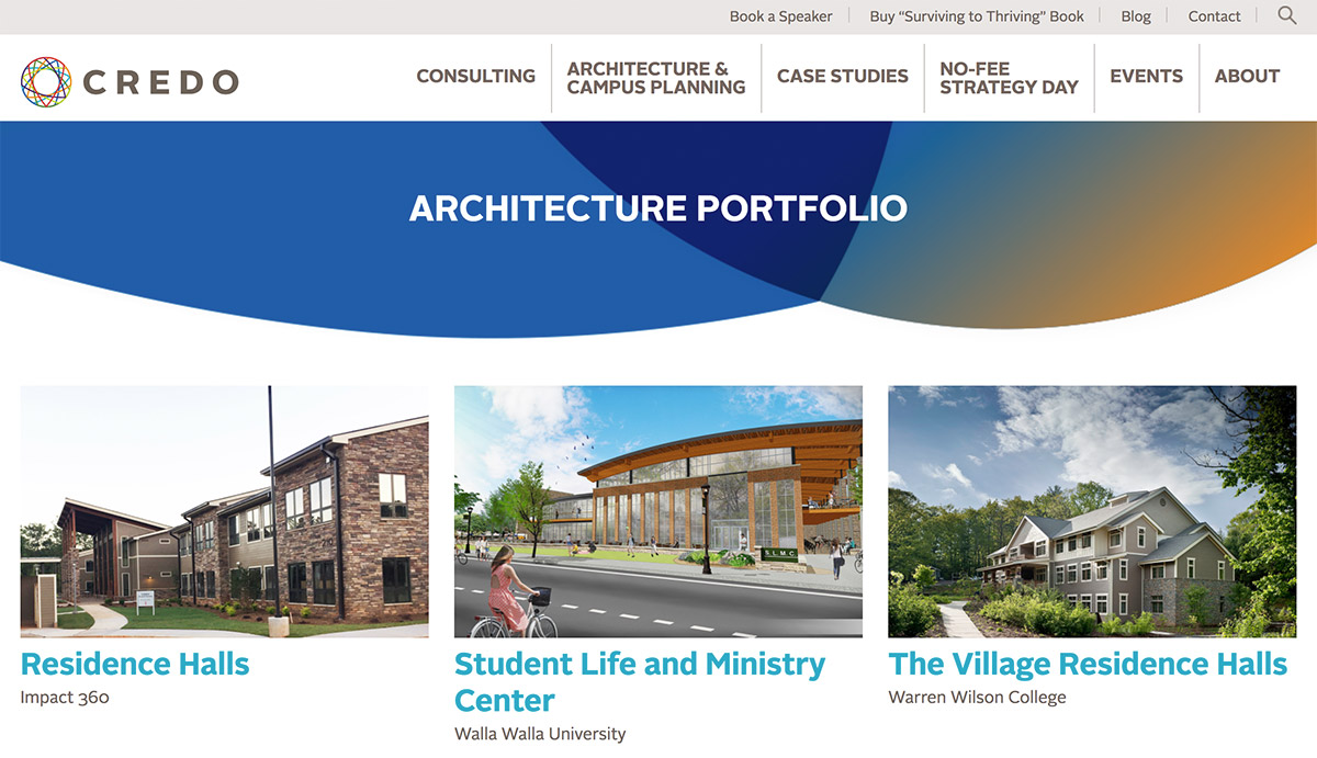
Credo's architecture portfolio section
After design work was approved, we started a 9-week web development process. The website was built on the HubSpot COS platform (their old website was also on HubSpot COS) to integrate the website seamlessly with HubSpot's marketing automation capabilities. That integration also enables leads collected from forms on the website to flow into Salesforce for the Credo consultants to then process.
Credo is able to easily change forms and create landing pages for future lead generation efforts.
Our team then migrated all existing content from the old website into the new website, then also entered some content that had to be newly written and created. Credo received a test link that was a fully functional website, and they were able to click through the new website, which brought the design to life.
During both design and development, user flow was carefully considered. Calls to action were placed at key points in the website to generate new leads. Our goal was to quickly get people to the information they are looking for, then have strategically-placed calls to action on the website that offer an option to dig deeper and provide access to further research.
After a handful of tweaks, the website was made live. To do this, we migrated the website from HubSpot's content staging area to the live site -- a process that occurred over a short period of time.
The most rewarding part of the project for our team was Credo's excitement and passion during the design process. The reward for Credo is a beautiful, lead generating website that will foster new conversations and sales opportunities.

