
In order to turn website visitors into business customers, you need at least one relevant, powerful call to action (CTA) on every page of your company's website. Whether it's signing up for a free trial of your software, subscribing to your company blog or downloading your latest guide or white paper, the CTA should draw customers from passive browsing towards a specific action.
One of the website problems we diagnose on business websites every day is how to improve page flow using calls to action. When you examine a web page for optimization ideas, you should be testing calls to action. So why might your CTA be ineffective? Here are three ways to improve underperforming calls to action.
1. Make your calls to action more visible
An obvious one, yes, but it isn't uncommon to come across a website where the CTA isn't immediately visible, or in the worst circumstances, nonexistent.
- Is your call to action buried among a lot of other text and graphics?
- Is it tucked into a remote corner of the page that needs to be reached with too much scrolling?
- Is the font is too small, or is it set against a background that doesn't jump out from the rest of the page?
Example

Moz uses color and size so that's it's obvious what the next steps are.
2. Make your action clear

This call to action on the Desk.com website is short, but descriptive enough to set expectations, especially when paired with the copy above the button.
What is it you want your website visitors to do from each specific page? You should be asking yourself this question each time you examine a web page for improvement ideas.
- Give your visitor clear directions and set their expectations about what they will see next.
- Tell them succinctly, using clear, short verbs.
- Don't be vague, don't use too many words, and don't give them too many choices.
- Keep your tone confident, but not pushy; don't overwhelm them with a swarm of exclamation points and flashing arrows.
You want to reduce the mental effort they have to put in to figuring out what you want and what they should do. Your website visitors are on your website for a reason (to learn more), so give them what they are looking for. They don't need to be sold, just pointed in the right direction. Otherwise they'll tune out, get frustrated, or just be too wary about clicking on any links or providing further information about themselves.
3. Give visitors a good reason to act
Your calls to action should be supported by the rest of the content on the page to improve relevance. Make sure that customers understand why it's important for them to respond to your CTA. Focusing on the benefits to your visitor in copy before or after the call to action will help create the relevance that your call to action needs to be successful.
Be sure to set your visitor's expectation, too. A call to action with the words "click here" are meaningless without some context. What will your visitor get when they click the CTA to the next step?
Example
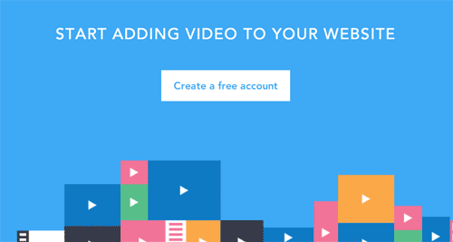
This call to action on Wistia.com is clear, succinct, and it's obvious where to click to start the free account. You know exactly why you should click the button and exactly what you'll get.
Optimizing your website calls to action is just a small part of what it takes to generate more leads from your website. If you want your CTA to resonate with customers, maybe you should consider calling an expert website design consulting firm to help you craft effective calls to action for your company website. We'd welcome your call or email.